Authentication Summary dashboard
The Authentication Summary dashboard displays authentication activity and system health with hourly data updates. Use it to understand login patterns, track MFA adoption, review geographic distribution, monitor authentication method adoption (SMS, MFA, passwordless), and ensure authentication infrastructure is performing properly.
For threat alerts and compromised accounts, see Risk Insights. For risk engine analyzer scores and credential stuffing detection, see Risk Intelligence.
System Health Overview
These summary cards show overall authentication system performance at a glance.
What it measures: Total authentication requests, successful and failed login rates, number of active users, and average Level of Assurance (LOA) score across all authentications.
Why it matters: Identifies when authentication services are degraded or experiencing issues that affect user login experience.
When to check: During peak usage times, after policy changes, or when users report login problems.

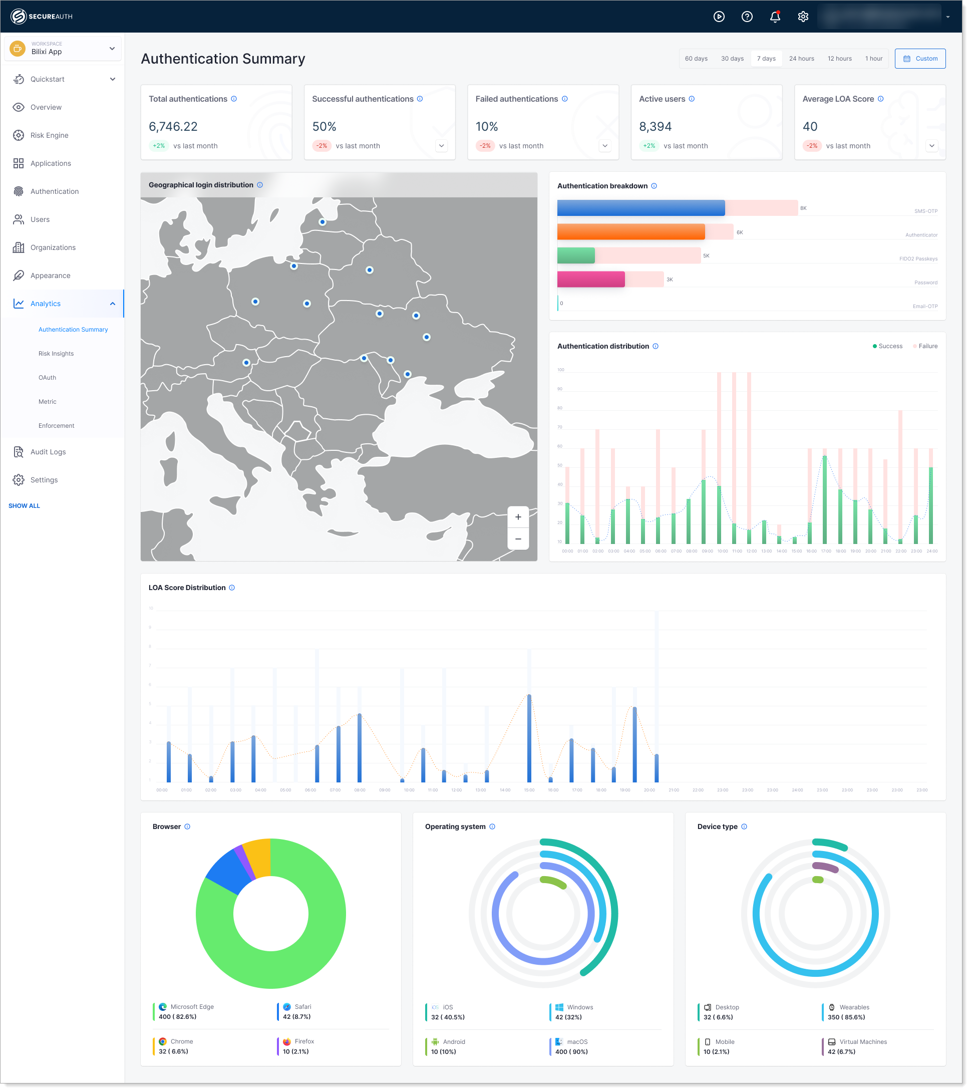
Geographical Login Distribution
This map shows which countries users are logging in from.
What it shows: A world map showing where users are logging in from. Blue dots mark login locations, and you can click on any region to see how many logins succeeded or failed from that location.
Why it matters: Helps you understand your user base geographic distribution and identify unusual login locations that might indicate account compromise or policy violations.
When to check: As part of regular security reviews, or when investigating suspicious login activity.
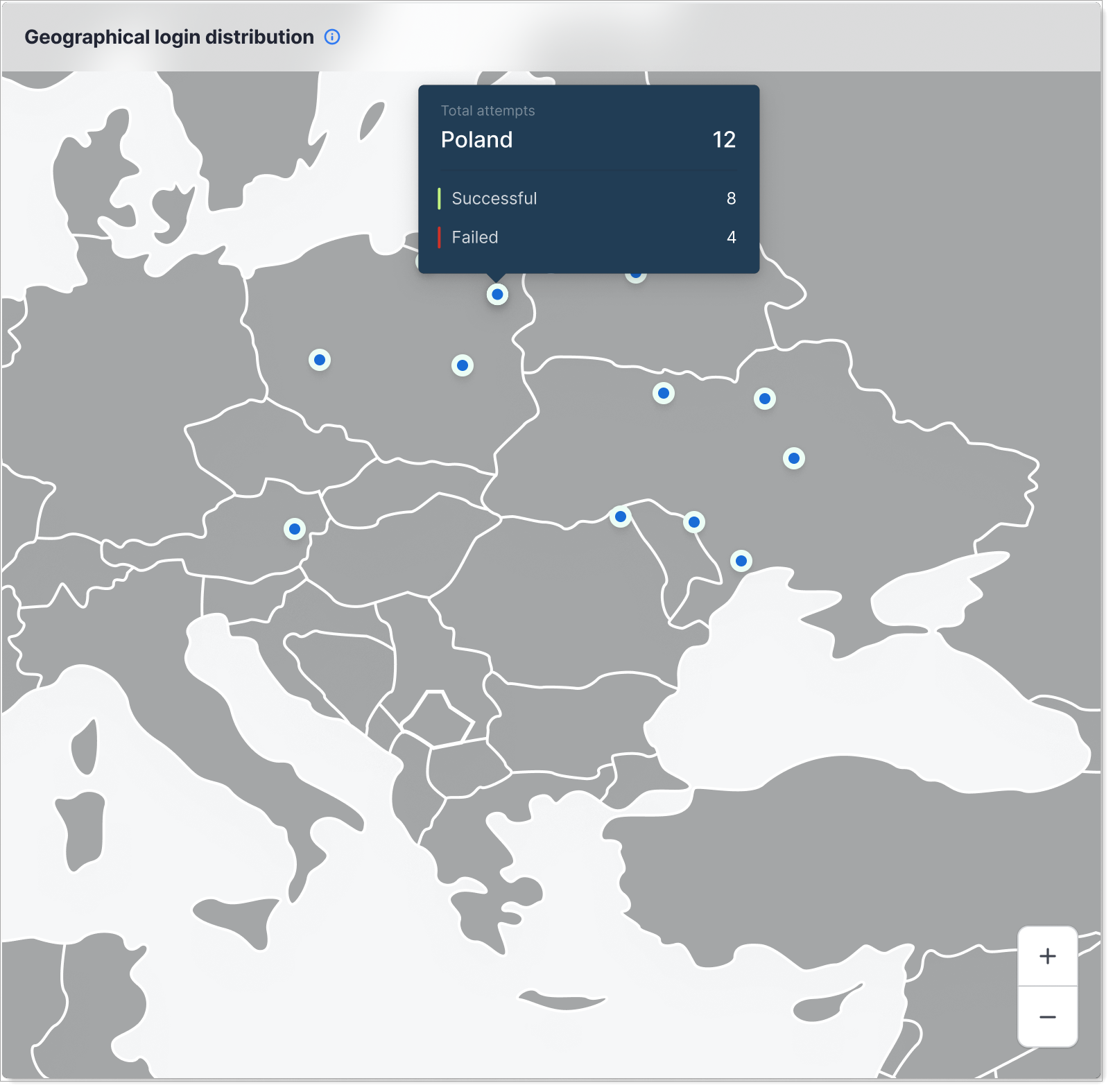
Authentication Breakdown
This chart shows the distribution of authentication methods users are using to log in.
What it shows: Horizontal bars showing how many logins used each authentication method: SMS text messages, authenticator apps, FIDO2 security keys, passwords, and email verification. The darker portion shows actual logins; the lighter bars show unused capacity for each method.
Why it matters: Tracks progress toward passwordless authentication goals and identifies adoption rates of security features like MFA.
When to check: To measure success of passwordless or MFA rollout initiatives.
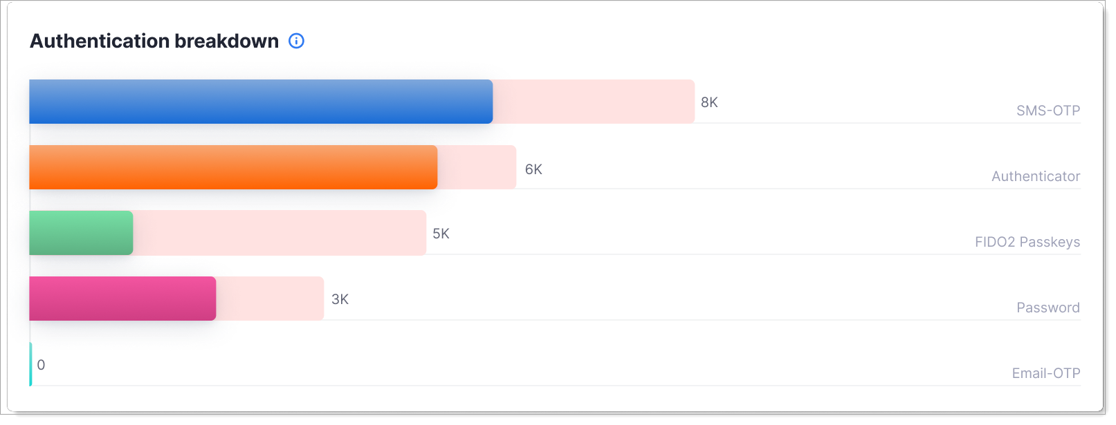
Authentication Distribution
This chart shows login activity patterns for your selected time period.
What it shows: Stacked bar chart showing successful (darker) and failed (lighter) login attempts by time. The dotted line shows the overall trend. The specific time period depends on your date range selection (24 hours, 7 days, 30 days, and so on).
Why it matters: Helps you establish what normal login activity looks like for your users, so you can quickly spot unusual patterns like off-hours spikes that might indicate compromise or attacks.
When to check: To understand user behavior and baseline authentication load.
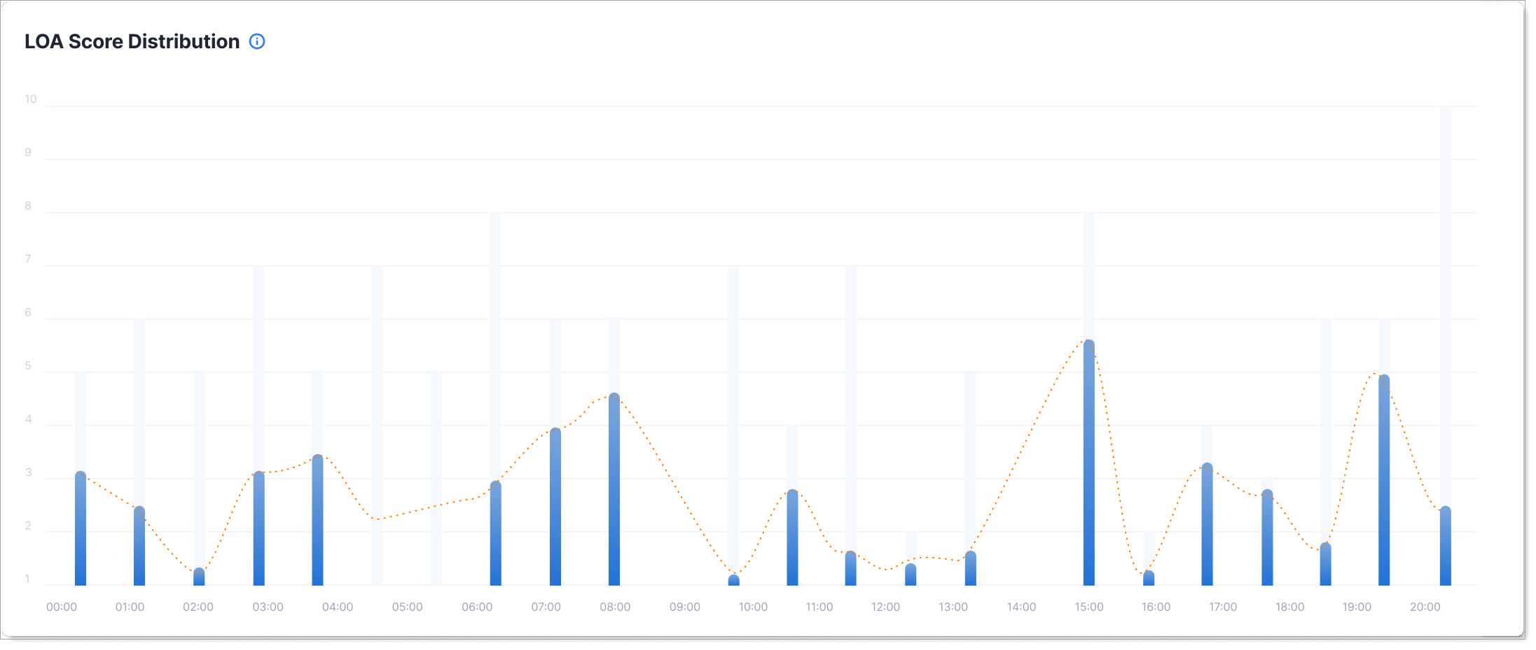
LOA Score Distribution
This chart shows how authentication confidence (Level of Assurance) changes over time.
What it shows: The average LOA score across all login attempts for your selected time period (24 hours, 7 days, 30 days, and so on). Blue bars show the LOA score for each hour or day. The dotted line shows the trend.
Why it matters: Lower LOA scores indicate weaker confidence in authentication and higher login risk. Track this over time to see if your authentication security is improving or declining, and identify periods when login confidence drops.
When to check: Regularly monitor LOA trends to ensure authentication quality stays strong, especially after policy changes or security updates.
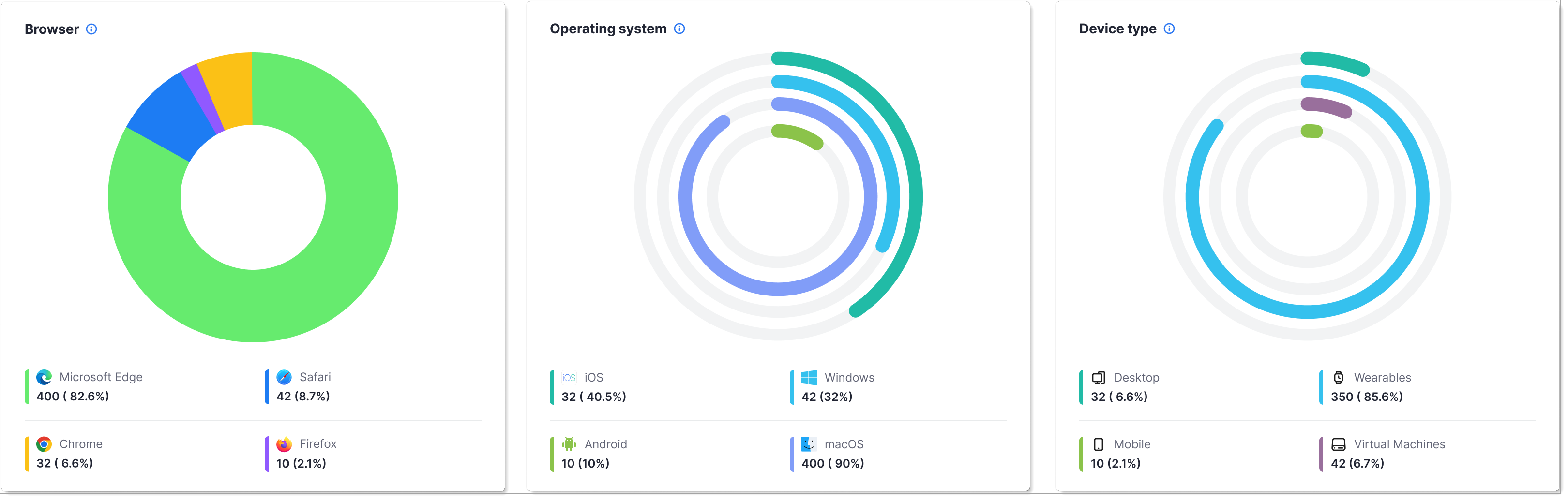
Device/Browser/OS Intelligence
This section shows the devices, browsers, and operating systems users are using to authenticate.
What it shows: Three separate donut charts showing: Browsers (Microsoft Edge, Chrome, Safari, Firefox), Operating Systems (Windows, macOS, iOS, Android), and Device Types (Desktop, Mobile, Wearables, Virtual Machines). Each shows the count and percentage of authentication attempts.
Why it matters: Helps you optimize the authentication experience for your user base and identify unsupported or vulnerable device/browser combinations.
When to check: When planning feature releases, assessing mobile vs desktop usage, or troubleshooting device-specific authentication issues.
How to use this dashboard
- In SecureAuth Connect, from the left menu, go to Analytics > Authentication Summary.
- Use the date range picker at the top to select the time period you want to analyze.
- Hover over charts to see detailed values.