Layout and events
The elements render content and no chrome. There is no page heading, no shell, no navigation around a pane, and no modal or drawer. That is what lets one sit in a layout you already have, and it means the layout is yours to supply.
Sizing
Each element is display: block with height: 100%, so it fills its container. Give that
container a definite height, or lay it out with flex or grid:
<div style="height: 600px"><sa-self-service></sa-self-service></div>
<div style="display: flex; height: 600px"><sa-self-service></sa-self-service></div>
A percentage height resolves against the parent's computed height, so a parent whose height is
auto leaves the element at its content height, and a mostly empty pane can end up a few
pixels tall. min-height alone does not fix it: the container stops collapsing, but as far as
the percentage is concerned the height is still auto.
Width needs nothing. The element fills a block container, and carries flex: 1 1 auto so it
fills a flex row rather than shrinking to its content.
Who scrolls
The element scrolls its own content inside the box you give it. If you would rather the page scrolled, let the container grow instead of constraining it, and the content extends down the page as any other block would.
Decide one or the other. A fixed-height container inside a scrolling page produces two scrollbars, which is the most common layout complaint and never looks deliberate.
A full page
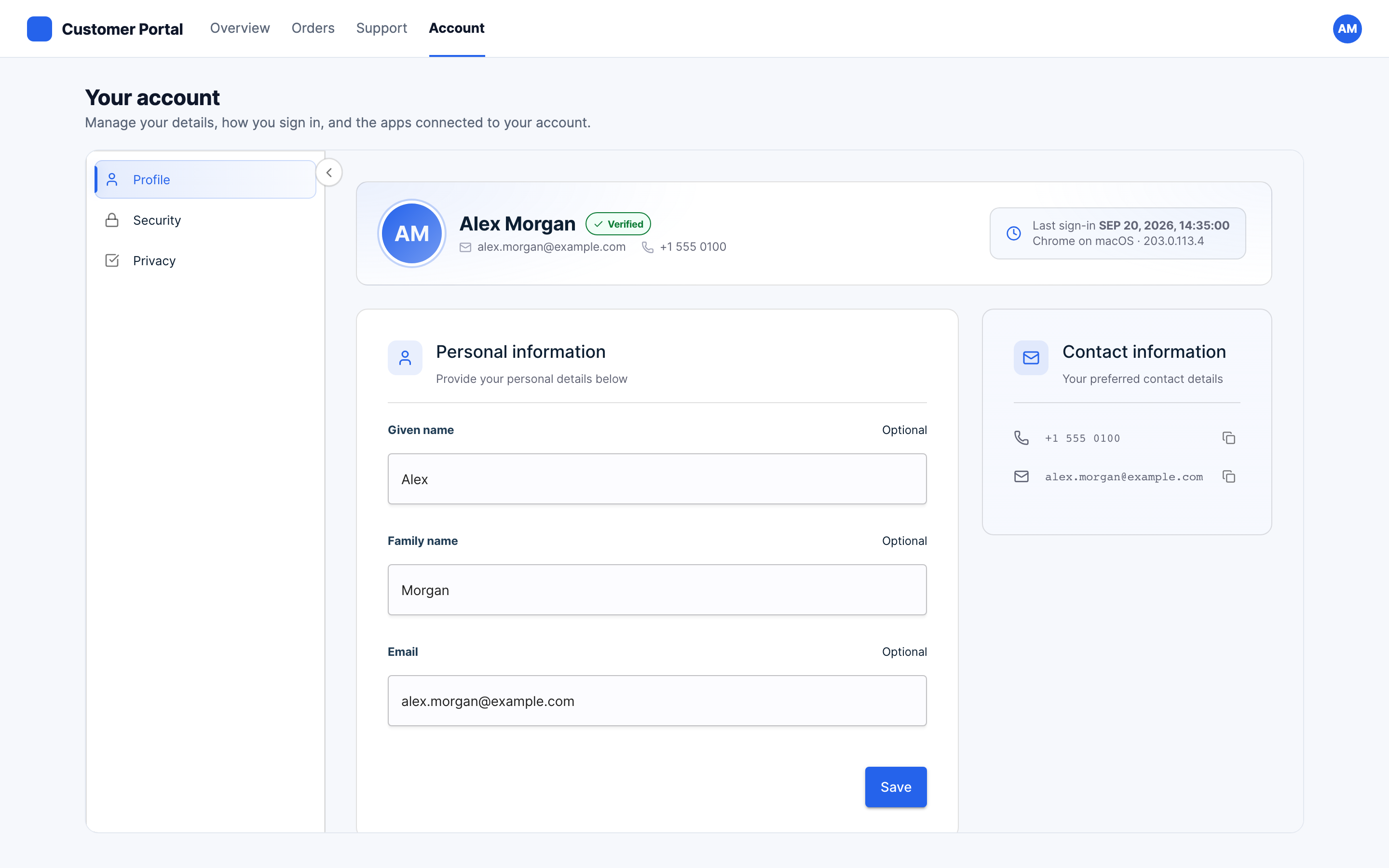
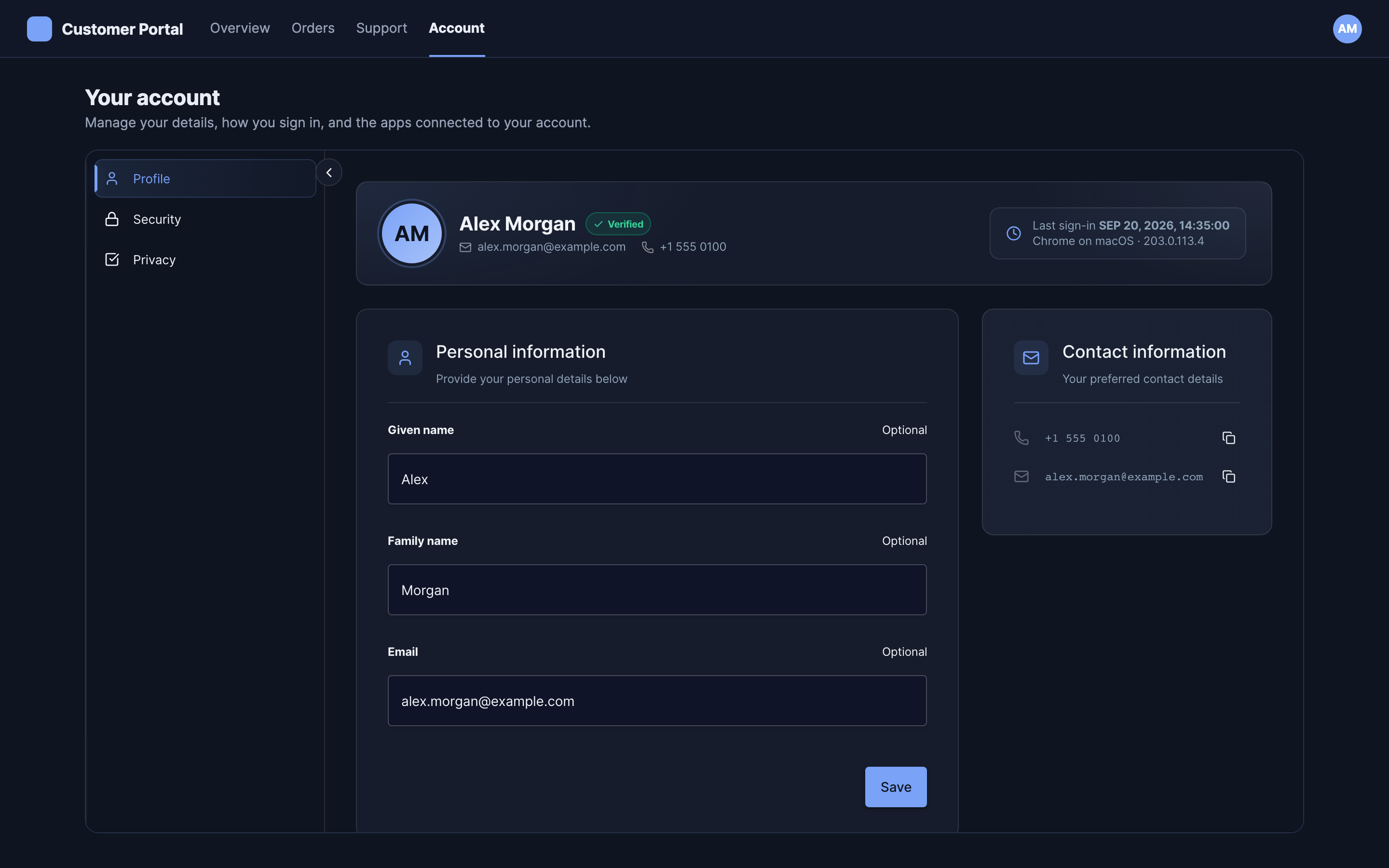
The most common placement: your own heading and navigation, with the composite below them.
<main class="account">
  <h1>Your account</h1>
  <p>Manage your details, how you sign in, and the apps connected to your account.</p>
  <div class="embed-frame">
    <sa-self-service></sa-self-service>
  </div>
</main>

<style>
  .account { display: flex; flex-direction: column; height: 100%; }
  .embed-frame { flex: 1; min-height: 0; border: 1px solid #e3e8f0; border-radius: 14px; }
</style>
A drawer or a modal
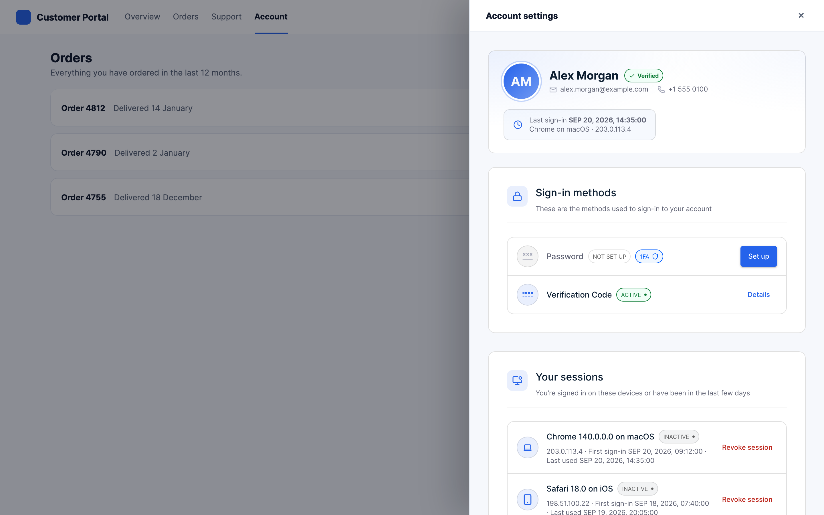
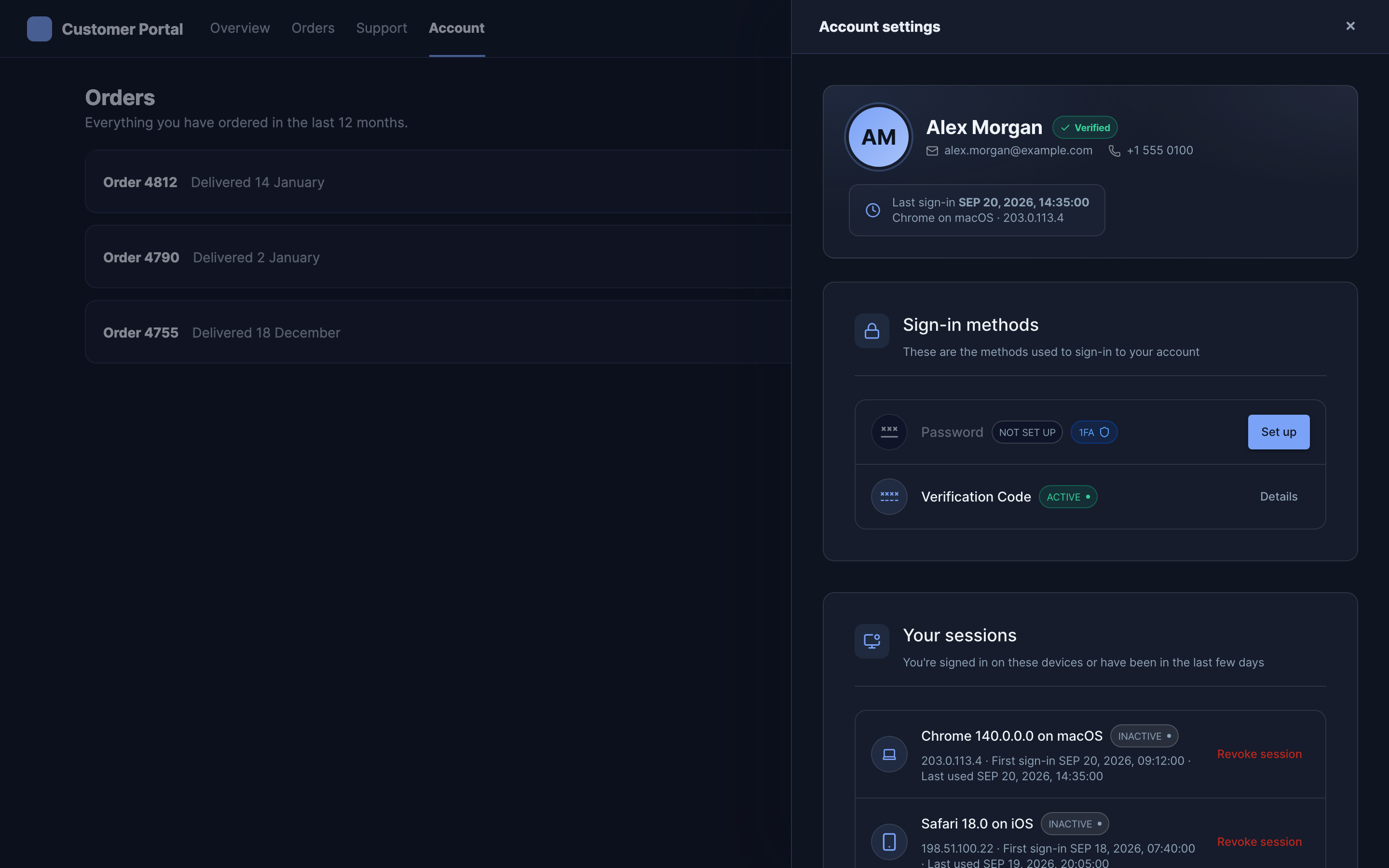
A drawer is narrow, so mount a single pane rather than the composite. The composite brings its own tab navigation, which needs width it will not have, and duplicates the title your drawer already has.
<aside class="drawer" hidden>
  <header><h2>Account settings</h2><button class="close">Close</button></header>
  <div class="drawer-body">
    <sa-self-service-security></sa-self-service-security>
  </div>
</aside>

<style>
  .drawer { position: fixed; inset: 0 0 0 auto; width: 620px; display: flex; flex-direction: column; }
  .drawer[hidden] { display: none; }
  .drawer-body { flex: 1; min-height: 0; }
</style>
The same applies to a modal. Give the body a definite height rather than letting the dialog grow with the content, or the modal becomes taller than the viewport on the panes that have the most to show.
Panes in your own layout
When your product already has places for each pane, mount them separately. Each renders on its own with no navigation around it, and your own navigation decides which one a person is looking at.
<sa-self-service-profile></sa-self-service-profile>
<sa-self-service-security></sa-self-service-security>
The admin console writes exactly this when the client's Embed tab is set to single panes.
Attributes are live
Setting an attribute re-renders the element in place rather than remounting it. The composite
takes view, so your own navigation can drive it:
document.querySelector("sa-self-service").setAttribute("view", "security");
Events
All events bubble and cross the shadow boundary, so you can listen on the element or on
document.
| Event | Detail | When |
|---|---|---|
sa-ready | none | Once per mount, when the element has rendered its data. |
sa-error | { type, message?, gating? } | A data load or authentication failure. |
sa-view-changed | { view } | Someone navigated inside the composite. Not fired for attribute writes. |
document.addEventListener("sa-ready", () => hideYourOwnSkeleton());

document.addEventListener("sa-view-changed", event => {
  history.replaceState(null, "", `/account/${event.detail.view}`);
});
Use sa-ready to take down your own loading state. Use sa-view-changed to keep your URL in
step with the pane a person is on, so a refresh lands them back where they were.
Error semantics
sa-error carries type: "unauthorized" | "forbidden" | "error" | "reauthentication_required",
and two shapes matter.
- Gating (
gating: true) means the element cannot render at all, usually a missing required attribute or a subject that does not exist. The view is replaced by a message that cannot be dismissed, since dismissing it would not help. Fix the attribute and the element recovers on its own. - Non-gating means a partial failure. The view stays live and usable, with a banner over it that can be dismissed.
A reauthentication_required error is the exception: see
Recent sign-in for sensitive changes.
A failed write does not raise sa-error. It surfaces as a notification inside the element,
because the person who caused it is the person who needs to see it.