Customize a Modern Theme
Use Modern Themes to apply your organization’s branding, such as logos, colors, and languages, to supported internal application pages.
Modern Themes apply only to Identity Management (IdM) pages in the New Experience, such as the SSO Portal and User Account pages. You can toggle on the Modernized Layout setting in the Internal Application Manager and attach a Modern Theme.
Note
Modern Themes do not apply to pre-authentication login pages or MFA pages. Those use the default theme selected in Advanced Settings > Overview tab, which is based on preset platform-wide UI options.
Applies to
Identity Platform release 26.0.0 or later
Supported internal applications in the New Experience UI
Create or edit a theme
In the left navigation, click Modern Themes.
Do one of the following:
To create a new theme, click Add Theme.
To copy the default theme, in the Default Theme section, click the Copy icon.
To edit the default theme, click Edit Default Theme.
Note
You can use the Restore Default Settings option to undo any customizations to the default theme.
Enter a Name and optional Description to help identify the theme.
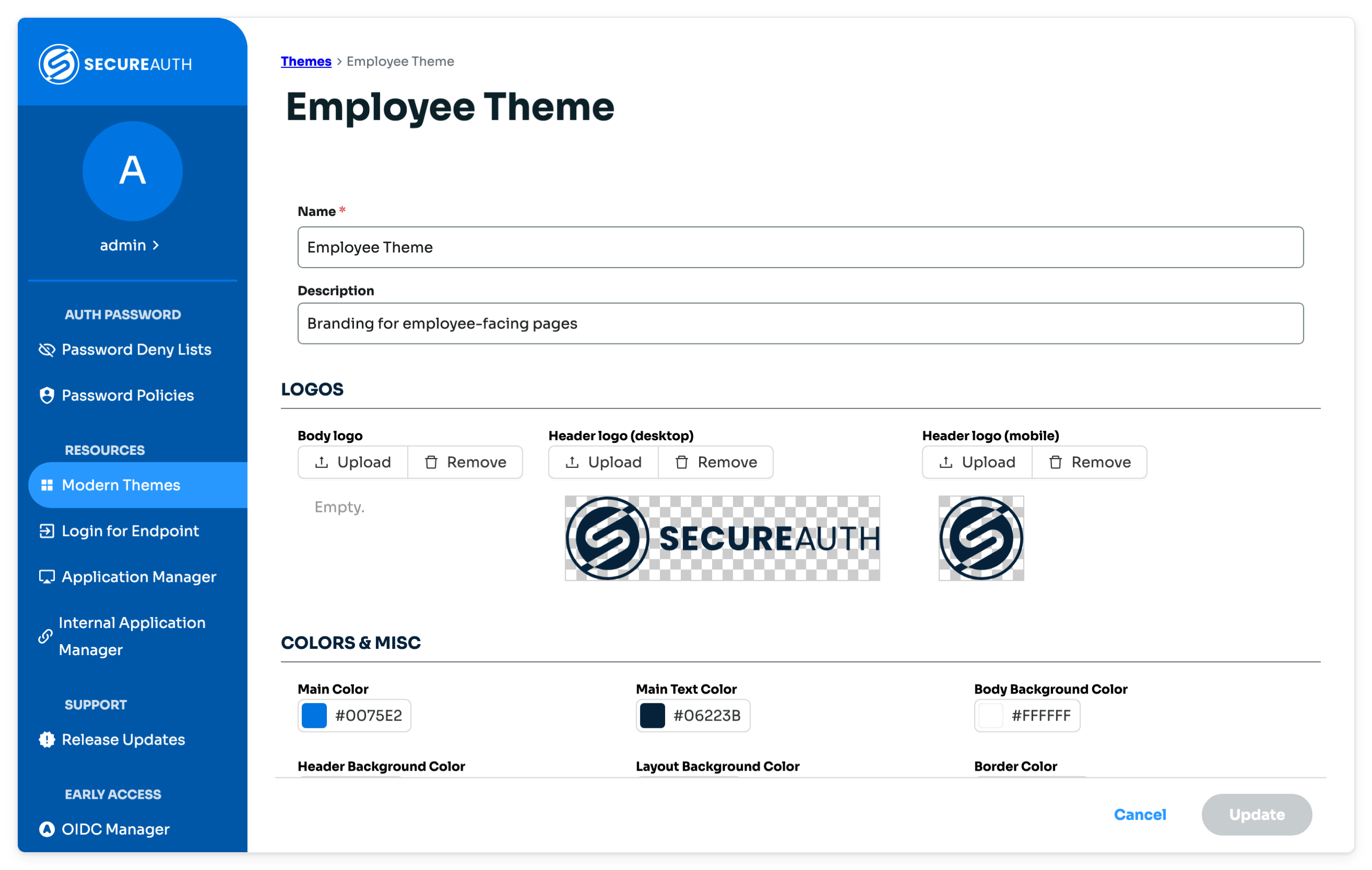
Theme form showing the name, description, logo, and color settings
Upload logos
Customize your application branding by uploading the following logos:
Body logo – Displays at the top center of the page
Header logo (desktop) – Displays at the top left corner on desktop layouts
Header logo (mobile) – Displays at the top left corner on mobile layouts
Tip
For best image quality, follow these guidelines:
Upload images with transparent backgrounds.
Accepted image formats are: jpeg, jpg, png, svg, or webp.
The maximum size allowed is: 512KB.
Set colors and layout
Setting | Description |
|---|---|
Main Color | Primary brand color used for buttons and accents |
Main Text Color | Color used for standard text |
Body Background Color | Background color of the main content area |
Header Background Color | Background color for the header |
Layout Background Color | Background behind the login form |
Border Color | Color used for borders around elements |
Info / Success / Warning / Error Colors | Status message colors for informational, success, warning, and error messages |
Border Radius | Control how rounded the edges appear on buttons, input fields, and cards:
|
Application Name Position | Set where the application name appears on the page. This is the name defined in the Internal Application Manager.
|
Customize content and localization
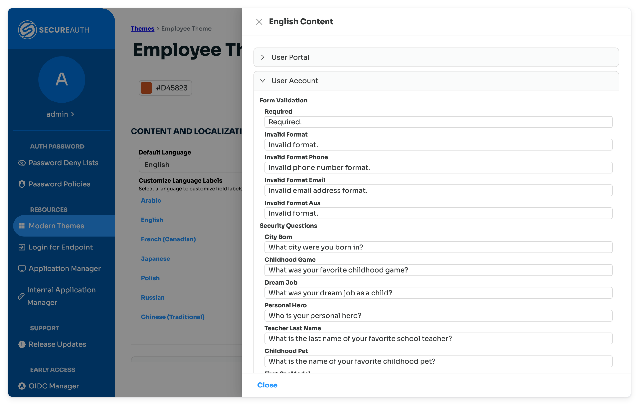
Use this section to set the default language and customize field labels across different languages.
 |
Under Default Language, choose the language that displays by default.
Under Customize Language Labels, click a language to edit its field labels.
You can customize fields like User ID, Email, or Phone to match your organization's terminology
For the User Account page, you can also reword the 16 security questions and the form validation messages under User Account.
Added in SecureAuth IdP release 26.4.0
Each language is stored separately per theme
Preview the theme
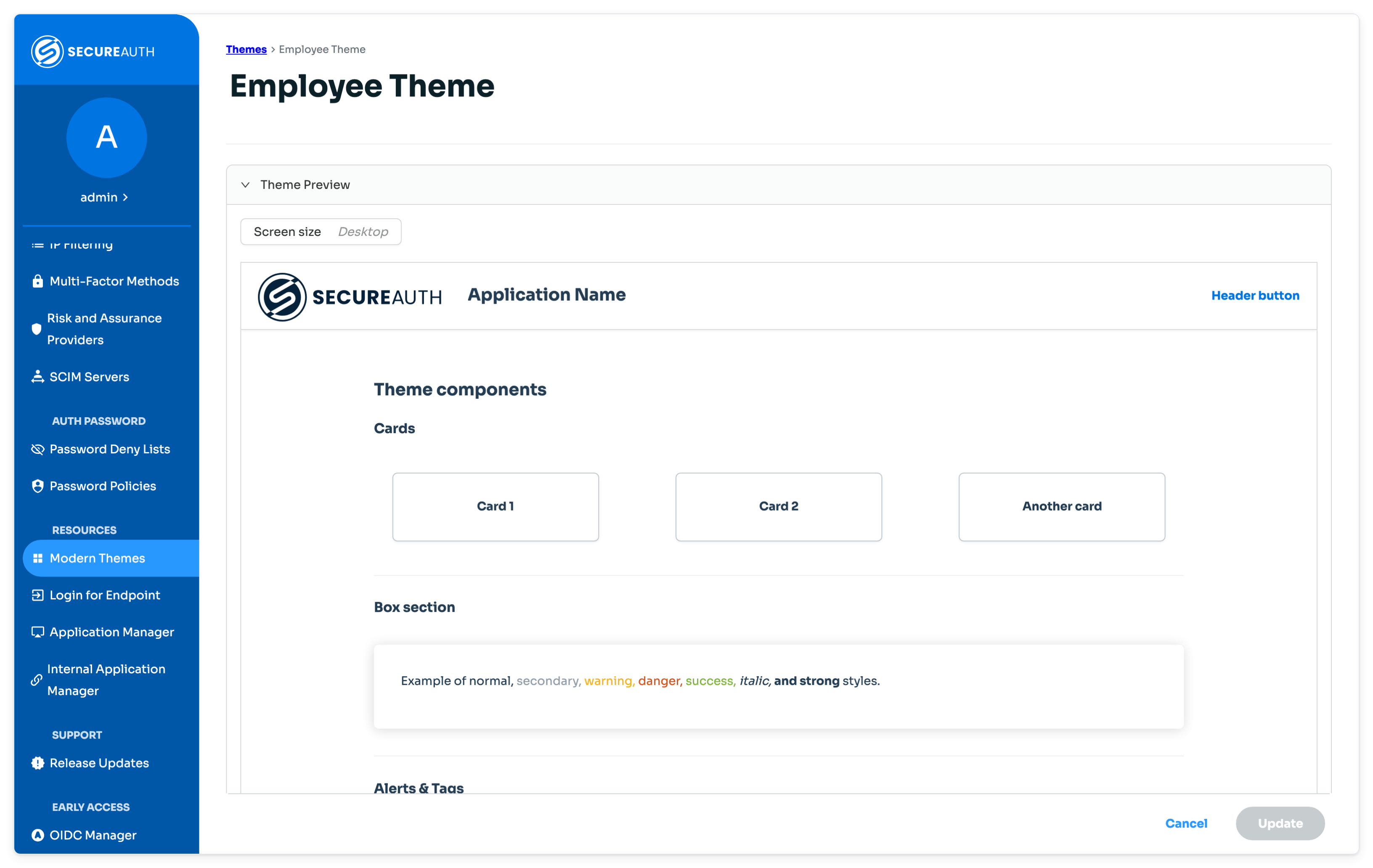
Click Theme Preview at the bottom of the page to see your design in real time. Use this to check logos, colors, and localization before applying the theme to an application.
By default, the Theme Preview displays the Desktop screen size. Click Screen size to select another layout size.
 |
What to do next
Attach a theme to an Identity Management page:
SSO Portal page, see SSO Portal configuration
User Account page, see User Account page configuration