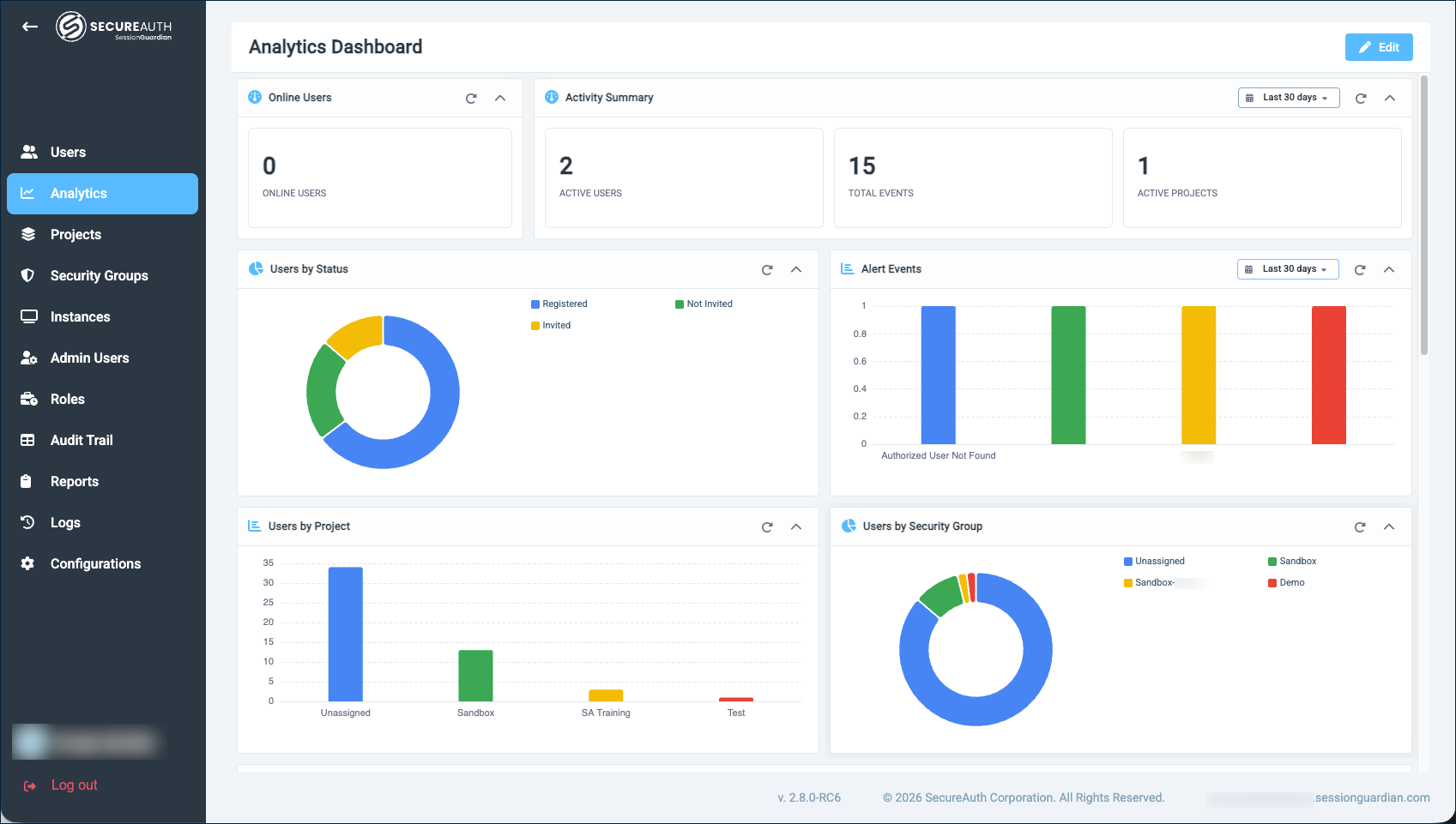
Analytics dashboard
The Analytics dashboard gives administrators a near real-time view of users, alerts, and client activity across the SessionGuardian instance. It replaces the legacy Dashboard in SessionGuardian Server 2.8.0.
Use it to answer everyday questions: Are my users where I expect them to be? How is alert activity trending? Which users are generating the most events? Each widget is sized for at-a-glance reading, with the option to dig into a specific time window when you want a closer look.
 |
What each widget tells you
The default dashboard ships with 10 widgets, grouped by what they answer.
Online Users
Use it to spot whether the user population currently signed in matches what you expect.
A single count of registered users with an active session right now. There is no time control – this is a point-in-time snapshot of who is online.
What to look for:
A drop during business hours can point to a client outage, a network issue, or a recent policy change blocking sessions.
An unexpected spike outside business hours can indicate access from a region or shift you did not plan for.
A persistently low number against a large registered population can mean users are not actively using SessionGuardian. Pair this with Users by Status to confirm whether registration is the bottleneck or usage is.
Activity Summary
Use it to quantify the breadth and volume of alert activity over the selected period.
Three KPIs:
Active Users – Distinct users whose activity included at least one alert event in the period. This is a measure of how many people are reflected in the alert data, not a measure of overall sign-ins.
Total Events – Total number of alert events recorded.
Active Projects – Distinct projects in which alert events were recorded.
What to look for:
A wide gap between Active Users and Total Events indicates alert events are concentrated among a smaller group of users. Pair with User Activity Summary to identify them.
A jump in Total Events while Active Users stays steady suggests the same population is producing more events – often a recurring environmental or device condition rather than a change in who is using the platform.
A jump in Active Projects can reveal a project that has come online or is producing more activity than expected.
Users by Status
Use it to check onboarding health and find users stuck in earlier states.
A pie chart of users grouped by account status:
New – User profile was created but no invitation has been sent yet.
Not Invited – Client software is installed for the user but no invitation has been sent.
Invited – An invitation has been sent. The user may have started, but not completed, registration.
Registered – The user has completed registration and can sign in.
A large Invited slice usually means invitations have gone out but users have not finished registering, which is a good prompt to follow up. A large Not Invited slice means the client is deployed for users who have not yet been invited to register.
Alert Events
Use it to see which alert types are firing and how that mix changes over time.
A bar chart with one bar per alert event type, sized by the number of distinct users who triggered that event during the selected period. Examples of alert event types include:
Unauthorized User Detected – A user other than the authorized session owner appeared in front of the camera.
Authorized User Not Found – The authorized user was not visible for an extended period.
Unauthorized Phone Detected – A mobile phone was detected in the camera view.
Webcam Covered, Webcam Failure, Webcam Unavailable – The webcam is obscured, has failed, or is disconnected.
Invalid IP, Invalid VPN, Invalid Geolocation – Access is coming from a location that violates the policy.
Use the per-widget time control to compare today against last week, and look for new bars appearing or familiar bars growing taller.
Users by Project
Use it to confirm users are landing in the right projects.
A bar chart of users per project. The chart reflects the current state of your system, not a time window.
What to look for:
Onboarding or migration – If you are bringing on a new project or moving users between projects, the bars should grow and shrink in line with what you have planned. A bar that has not moved when you expected it to is a sign the assignment did not take effect.
Unexpectedly large project – Often a sign that users were assigned to the wrong project, or that one project is acting as a catch-all that needs finer segmentation.
Empty or near-empty project – A project no one is assigned to may be a candidate for retirement, or a sign that intended assignments have not happened yet.
One project dominating the chart – Useful context, but worth confirming whether a single project is appropriate for the breadth of users you have.
Users by Security Group
Use it to verify your security-group population matches your policy.
A pie chart of users per security group. Security groups govern access policies in SessionGuardian, so the size of each slice should track how broadly each policy is meant to apply.
What to look for:
A restricted group that is unexpectedly large – A policy intended for a small population now applies to more users than intended. Worth reviewing the assignments.
A staffed group that is unexpectedly empty – Users you expected to be governed by that policy are not. The policy is not in effect for them.
Drift over time – If you watch this widget over weeks, the proportions should stay roughly in line with your access policy. A slow shift can indicate group assignments are not being maintained as the user population changes.
Client Event Trends
Use it to spot when normal client activity changes.
Client events are operational events emitted by the SessionGuardian client during a protected session – the steady stream that shows the platform is being used as expected. The chart plots one line per event type over the selected period. Common groups of client events include:
Secure-session lifecycle – Secure session started, secure session stopped, VM window opened, user system environment captured.
Mobile authentication – QR code displayed, mobile-verified user.
Identity verification – Authorized user detected, authorized user not found.
Screen state – Screen locked, screen unlocked.
Device detection – Mobile phone detected, webcam settings changed.
Read the shape of the chart, not just the absolute numbers:
A sudden drop in secure-session events can mean clients are not starting sessions as expected.
A widening gap between QR code displayed and mobile-verified user can indicate users are starting the mobile authentication flow but not completing it.
A spike in screen-locked events outside business hours may simply reflect users stepping away, or it may point to a policy or device change worth confirming.
A new line that appears for the first time is worth investigating, especially for detection or webcam events.
Click any event name in the legend to hide or isolate that line so you can compare trends one at a time.
Users by Client Event Count
Use it to identify your most active users and see at a glance what kinds of activity are driving their volume.
A horizontal bar chart of the top users by total client event count over the selected period. Each user's row is one stacked bar where each colored segment represents one client event type (see Client Event Trends for examples). The length of the bar is the user's total event count; the size of each segment shows how much of that total came from each event type.
What to look for:
Top of the list – Users with bars dramatically longer than the rest. A single high-volume user can mean a power user, a test or service account, or an unusual workflow worth confirming.
Composition – Compare the colors in each user's bar:
Heavy on mobile-authentication segments suggests the user is reauthenticating often.
Heavy on screen locked / unlocked segments suggests the user is stepping away from their workstation a lot.
Heavy on secure-session start/stop segments suggests short, repeated protected sessions rather than one long one.
Bottom of the list – Users with very short bars or none at all may be inactive in the selected period. Combine this with User Activity Summary to confirm.
Client Event Breakdown
Use it to see the composition of client traffic at a glance.
A pie chart of client events by type over the selected period. Where Client Event Trends shows when activity is happening, this widget shows what the activity is made of, as a share of the total.
What to look for:
Dominant slices – Secure-session lifecycle and identity-verification events typically make up the largest slices on a healthy instance.
Mobile-authentication share – Compare the QR code displayed and mobile-verified user slices. A noticeable gap between them is consistent with the same drop-off signal called out in Client Event Trends.
Unusual event growth – A slice for a webcam or detection event growing into a meaningful share of the pie is worth investigating against your policy and device fleet.
Same period, two views – Set this widget and Client Event Trends to the same time window. The pie shows the totals; the line chart shows the timing.
User Activity Summary
Use it to see which users have the most alert events over the selected period and when each user last had one.
A sortable table with one row per user, showing:
Account Username – The user's operating system account.
Event Count – The total number of alert events for that user over the selected period.
Last Event Time – The timestamp of the user's most recent alert event.
Click any column header to sort the table.
What to look for:
Sort by Event Count, descending – The top rows are the users with the most alert events. A consistently high count for the same user is often a sign of an environmental or device condition (such as a webcam that frequently fails) rather than a user issue. Use it as a prompt to investigate the cause.
Sort by Last Event Time, descending – The top rows are the most recent alert events on the platform. Use this view when you are responding to something happening right now.
Sort by Last Event Time, ascending – Surfaces users whose last alert event was a long time ago. They may have settled into normal patterns, changed devices or roles, or stopped using SessionGuardian. Cross-check with Online Users and Users by Status.
Names appearing for the first time – A user near the top of the count list who was not there last period can indicate a recent environment, device, or behavior change worth a closer look.
Change the time window on a widget
Widgets that support a time filter show a date control in their header (for example, Last 90 days). Changing the time window affects only that widget, so you can compare different periods side by side.
Pick a preset (Last 30 seconds through Last 90 days), enter a custom relative range (for example, Last 5 days or Last 2 weeks – supported units are minutes, hours, days, weeks, and months), or set a custom absolute range with a begin and end date and time.
A few widgets show point-in-time data and do not have a time control. These always reflect the current state of your system:
Online Users
Users by Status
Users by Project
Users by Security Group
Customize the dashboard
You can rearrange, add, or remove widgets to match how you work.
Click Edit in the top-right corner of the dashboard to enter edit mode.
Make your changes:
Add a widget. Click + Add Widget and choose Data Table, Bar Chart, Pie Chart, Line Chart, or KPI Group. The new widget appears at the bottom of the dashboard. Open its settings to give it a title and a data query.
Reorder or resize. Drag a widget by its header to move it on the grid. Drag the bottom-right corner to resize.
Remove a widget. Click the × in the widget header.
Reset to defaults. Click Reset to discard your changes and return to the shipped layout, including any default widgets you removed. Reset appears in the toolbar only after you make a change in edit mode: add a widget, edit a widget, or remove one. From the unmodified default view, the button does not display.
Click Save to keep your changes, or Cancel to discard them.
Configure a custom widget
The Widget Settings dialog has two main inputs that determine what the widget shows: Data Query (JSON) describes the data to fetch, and Label Transformer describes how to present the result labels.
Data Query (JSON)
The data query is a JSON object with these key fields:
source– The data source. Useeventsfor session-event data (time-series) orusersfor the user table (current state).query– An optional filter expression that limits which records to include, for exampleevent_name:CLIENT_*orevent_name:LOGIN AND project_name:"ProductionApp".bucketAggs– An optional list of groupings. Common types areterms(group by a field's values),date_histogram(group by time interval), andhistogram(group by numeric ranges).metrics– One or more calculations to apply to each group, such ascount(number of records) orcardinality(number of distinct values in a field).
Label Transformer
The Label Transformer converts raw bucket keys (often numeric IDs or short codes) into human-readable labels on the rendered chart. Choose one of:
None – Bucket keys are already readable (such as project name, security group name, or client event name).
User status – Use when you group by the user
statefield. Maps codes such asREGISTEREDandNOT_INVITEDto Registered, Not Invited, and so on.Alert Event Name – Use when you group by
event_id. Maps numeric event IDs to alert event names such as Webcam Covered and Unauthorized User Detected.
Examples
The following examples are based on the queries used by the default dashboard widgets. Copy them as starting points and change the fields for your use case.
Group users by status:
{
  "source": "users",
  "bucketAggs": [{ "type": "terms", "field": "state" }],
  "metrics": [{ "type": "count", "id": "1" }]
}
Pair this query with the User status Label Transformer so the chart shows readable labels instead of raw state codes.
Group users by project:
{
  "source": "users",
  "bucketAggs": [{ "type": "terms", "field": "project_name" }],
  "metrics": [{ "type": "count", "id": "1" }]
}
Use None as the Label Transformer because project names are already readable. To group by security group instead, change project_name to security_group_name.
Plot client event activity over time:
{
  "source": "events",
  "query": "event_name:CLIENT_*",
  "timeField": "timestamp",
  "bucketAggs": [
    { "type": "date_histogram", "field": "timestamp", "settings": { "interval": "day" } },
    { "type": "terms", "field": "event_name" }
  ],
  "metrics": [{ "type": "count", "id": "count" }]
}
Use None as the Label Transformer because client event names are already readable. This query is used by the Client Event Trends widget and pairs well with a line chart.
Note
Contact your SecureAuth representative for help building more complex queries.
Where your customizations are saved
Customizations to the Analytics dashboard are saved to the browser you are using, not to your SessionGuardian account.
The layout persists across sign-ins in the same browser on the same device.
Opening the dashboard in a different browser, in a different profile, or on a different device shows the shipped default layout there.
Clearing your browser's site data for SessionGuardian removes your saved layout. Cookies and session storage are not used for the layout.